Colours transcend mere aesthetics in interior design; they serve as the foundational elements that shape the atmosphere, influence moods, and define the overall experience within a room. How does one adeptly choose and blend colours to craft harmony and functionality in interior spaces?
The influence of colours on well-being
Before selecting specific colours, it is imperative to recognise the profound impact colours have on our well-being. Each colour possesses its own meaning, triggering distinct emotions and feelings. For instance, the warmth of red can evoke passion and energy, while the coolness of blue instils a sense of calm and tranquillity. Thus, it is essential to choose colours that align with the desired atmosphere in a particular room.
Choosing the right colour shades
When selecting colour shades for interior spaces, several factors should be taken into account.
Atmosphere and Functionality
Begin by contemplating the room’s purpose. Whether it’s a living space designed for relaxation or a workspace demanding focus, colours can evoke different feelings, making it crucial to choose those that align with the room’s functionality.
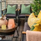
Colour combination
Successful interior design hinges on the combination of colours. The widely embraced 60-30-10 rule allocates 60% to the dominant colour, 30% to the secondary colour, and 10% to the accent colour. This approach yields a balanced and visually appealing perception of the space.
Colour circle
An understanding of the colour wheel facilitates the selection of harmonious colour combinations. Complementary colours, positioned opposite each other on the colour wheel, complement each other and create vibrant contrasts.
The influence of light
Recognise that the same colour can appear vastly different under varied lighting conditions. Therefore, consider both natural and artificial lighting when choosing colours.
The importance of colour psychologies
Delve into colour psychology, which explores the impact of colour on emotional and physical well-being.
Yellow: Encourages creativity and joy.
Blue: Enhances calmness and confidence; darker shades signify elegance, while lighter shades evoke calm.
Green: Symbolises nature, balance, and freshness, offering a calming effect.
Red: Evokes passion and energy but requires judicious use to avoid excessive excitement.
White: Emphasises purity, simplicity, and spaciousness.
Black: Adds elegance and power.
Practical tips for using colours
Colour samples
Prior to finalising the colour palette, create sample panels to compare different shades. Observe how colours interact in a room and respond to varying lighting conditions.
Use neutral colours
Harness the power of neutral colours like gray, beige, and white as a foundational base, allowing other colours to stand out.
Adapt to the space
Tailor colour choices to the room’s size and shape. Lighter colours can create a sense of openness in smaller spaces, while darker hues foster intimacy in larger areas.
Consult an expert
When uncertain about colour choices, seek guidance from an interior design professional. An experienced designer can recommend the best color shades tailored to your preferences and needs.
The utilization of colors in interior design is an art that necessitates an understanding of color psychology, spatial functionality, and visual harmony. Thoughtfully selected and combined color shades can transform any room into a unique and pleasant environment, reflecting the desires and needs of its inhabitants.
For further insights into interior design, explore our articles on https://bazarealestate.com/en/news/